Note_Tech
All technological notes.
Project maintained by simonangel-fong Hosted on GitHub Pages — Theme by mattgraham
Bootstrap - Grid
Containers
Container:- Containers are the most basic layout element in Bootstrap and are required when using our default grid system.
- used to pad the content inside of them
| Class | Description |
|---|---|
container |
a responsive fixed width container |
container-fluid |
a full width container, spanning the entire width of the viewport |
- By default, containers have left and right padding, with no top or bottom padding.
Grid system
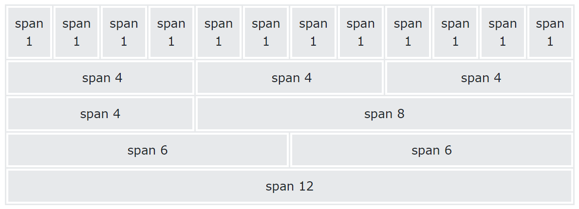
- Bootstrap’s grid system is built with flexbox and allows up to 12 columns across the page.
Grid Classes
-
The Bootstrap 5 grid system has six classes:
col-: extra small devices(less than 576px)col-sm-: small devices(equal to or greater than 576px)col-md-: medium devices(equal to or greater than 768px)col-lg-: large devices(equal to or greater than 992px)col-xl-: xlarge devices(equal to or greater than 1200px)col-xxl-: xxlarge devices(equal to or greater than )1400px
-
Template
<div class="container text-center">
  <div class="row">
    <div class="col">Column</div>
    <div class="col">Column</div>
    <div class="col">Column</div>
  </div>
</div>

<!-- control how many columns that should appear next to each other -->
<div class="row row-cols-1">
  <div class="col">1 of 2</div>
  <div class="col">2 of 2</div>
</div>

<div class="row row-cols-2">
  <div class="col">1 of 4</div>
  <div class="col">2 of 4</div>
  <div class="col">3 of 4</div>
  <div class="col">4 of 4</div>
</div>
Gutter
- Gutters are the padding between columns, used to responsively space and align content in the Bootstrap grid system.
| Class | Description |
|---|---|
g-0 |
No gutters |
g-num |
Horizontal & vertical gutters |
g-size-num |
Horizontal & vertical gutters with size |
gx-num |
horizontal gutter |
gy-num |
vertical gutter |
- num: 0-5
- size: sm, lg